
In the ever-evolving landscape of web design, staying abreast of emerging trends is imperative for designers aiming to create engaging and intuitive user experiences. One such trend that has gained significant traction is the Bento Grid Design. This innovative layout draws inspiration from the traditional Japanese bento box, offering a harmonious blend of aesthetics and functionality. In this comprehensive exploration, we delve into the nuances of Bento Grid Design, its benefits, implementation strategies, and its impact on modern web design.
Understanding Bento Grid Design
The term “Bento Grid Design” is derived from the Japanese bento box—a compartmentalized meal container that neatly organizes diverse food items. Similarly, in web design, a Bento Grid Layout divides content into distinct sections or compartments, each dedicated to a specific piece of information. This approach ensures a clean, organized, and visually appealing presentation, enhancing the overall user experience.
Origins and Evolution
The Bento Grid Design trend has been influenced by various design philosophies over the years. Notably, Apple’s promotional videos have showcased grids featuring product specifications and features, making typically mundane spec lists visually appealing by organizing them in a grid with a mix of visuals and typography.
Benefits of Bento Grid Design
- Enhanced Visual Hierarchy
By allocating varying sizes and positions to different content blocks, designers can emphasize essential information, guiding users’ attention effectively. This clear visual hierarchy ensures that users can quickly identify and focus on critical content without feeling overwhelmed. - Improved User Engagement
The organized structure of Bento Grids facilitates seamless navigation, allowing users to interact with content effortlessly. This intuitive layout encourages prolonged engagement, as users can easily locate and explore sections of interest. - Versatility Across Devices
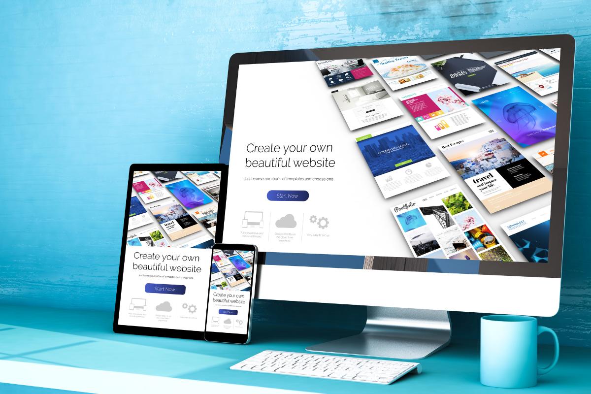
Bento Grid Designs are inherently responsive, adapting gracefully to various screen sizes. This adaptability ensures a consistent and optimized user experience across desktops, tablets, and mobile devices. - Aesthetic Appeal
The compartmentalized layout offers a minimalist and clean aesthetic, aligning with contemporary design preferences. This visual appeal can enhance brand perception and contribute to a positive user experience.
Implementing Bento Grid Design: Best Practices
- Content Prioritization
Identify and prioritize key content elements that warrant prominence. Assign larger or more strategically positioned compartments to these elements to draw user attention effectively. - Consistent Spacing and Alignment
Maintain uniform spacing and alignment across all compartments to ensure a cohesive and balanced layout. Consistency in design elements contributes to a polished and professional appearance. - Responsive Design Considerations
Ensure that the grid layout is flexible and adjusts seamlessly to different screen sizes. Implement media queries and flexible grid structures to maintain functionality and aesthetics across devices. - Visual Harmony
Utilize complementary color schemes, typography, and imagery within the compartments to create a harmonious visual experience. Cohesive design elements enhance the overall appeal and usability of the website.
Bento Grid Design in Practice: Inspiring Examples
To illustrate the versatility and effectiveness of Bento Grid Design, consider the following exemplary implementations:
- Personal Portfolios
Designers and artists can showcase their work using Bento Grid layouts, allowing each project or artwork to occupy its dedicated compartment. This organization facilitates easy navigation and highlights individual pieces effectively. - E-commerce Platforms
Online stores can utilize Bento Grids to display product categories, featured items, and promotions in distinct sections. This structured presentation enhances the shopping experience by enabling users to browse products effortlessly. - Content-Rich Websites
News portals and blogs can benefit from Bento Grid layouts by organizing articles, videos, and other content types into separate compartments. This arrangement allows users to quickly access content of interest, improving engagement metrics.
Challenges and Considerations
While Bento Grid Design offers numerous advantages, designers should be mindful of potential challenges:
- Complexity in Hierarchy
Ensuring a clear content hierarchy within the grid can be challenging. Designers must strategically assign sizes and positions to compartments to maintain an intuitive flow of information. - Consistency Across Devices
Achieving uniformity in the grid layout across various devices requires meticulous planning and testing. Responsive design principles must be diligently applied to ensure a seamless user experience. - Content Limitations
The compartmentalized nature of Bento Grids may not be suitable for content that requires extensive horizontal space, such as detailed tables or wide-format images. Designers should assess content requirements before opting for this layout.
Conclusion
Bento Grid Design represents a fusion of aesthetic elegance and functional efficiency, making it a compelling choice for modern web design. By organizing content into distinct, visually appealing compartments, designers can enhance user engagement, improve navigation, and create memorable digital experiences. As with any design trend, thoughtful implementation and adherence to best practices are crucial to harnessing the full potential of Bento Grid Design.